
 | ||
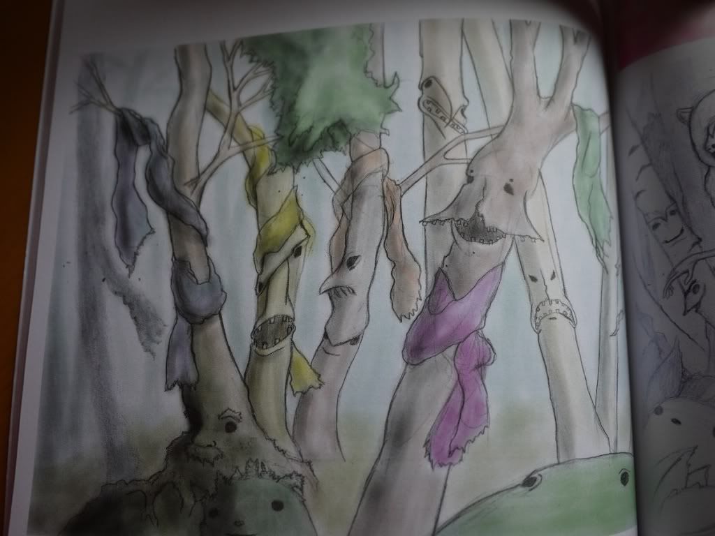
| "Humans would tie bits of cloth and or paper to trees as offerings and as a means of communicating with the spirits within" (Funny, this reminded me of the Chinese wishing tree where we write our wishes on paper and throw it up onto a tree. How cool is that?) |
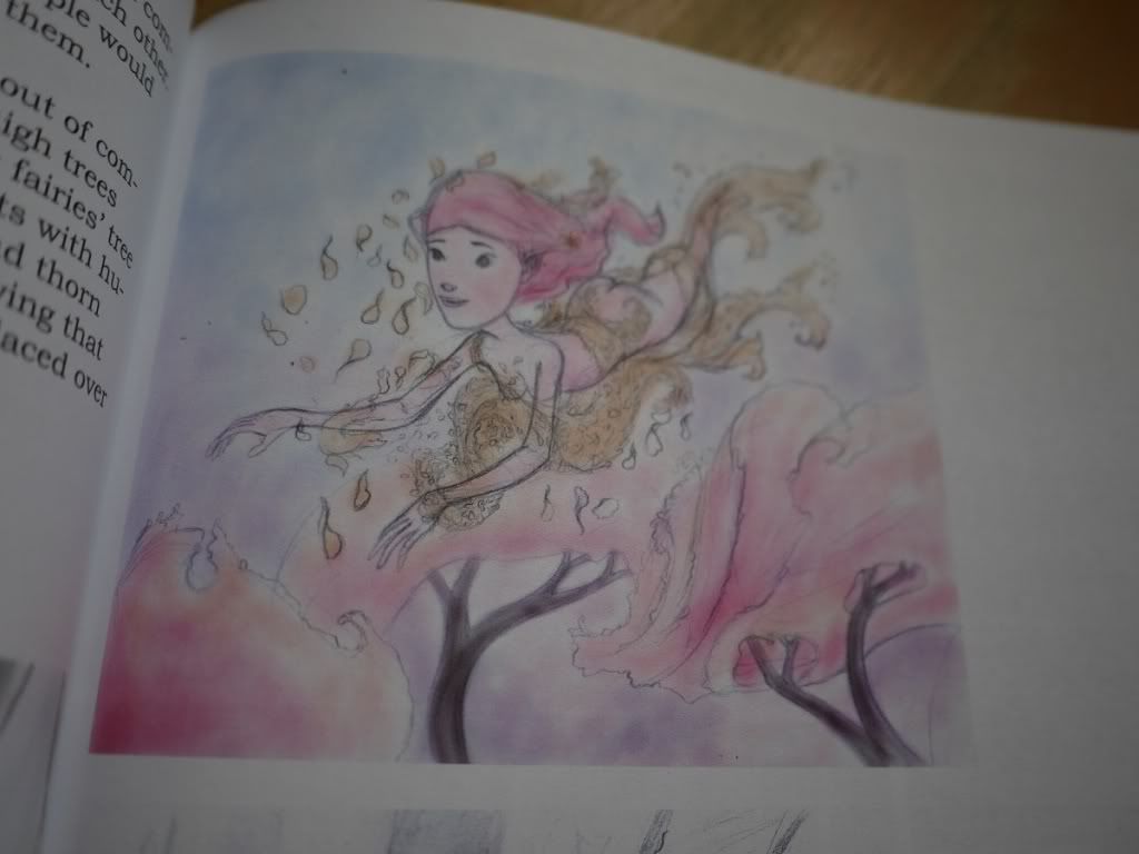 |
| I hate to admit it but I'm loving the pink. Yes, pink =P |
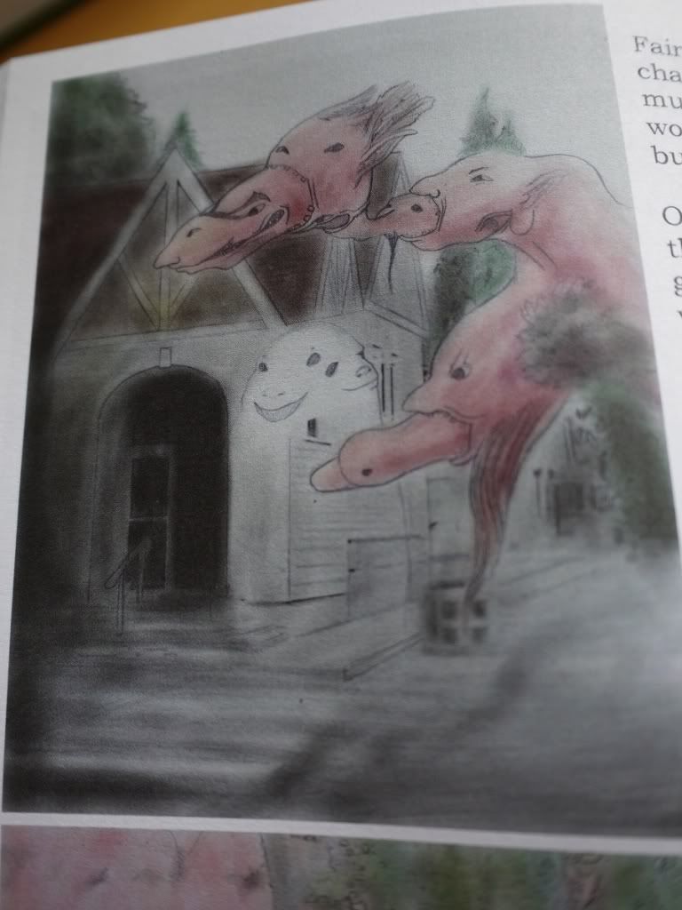 |
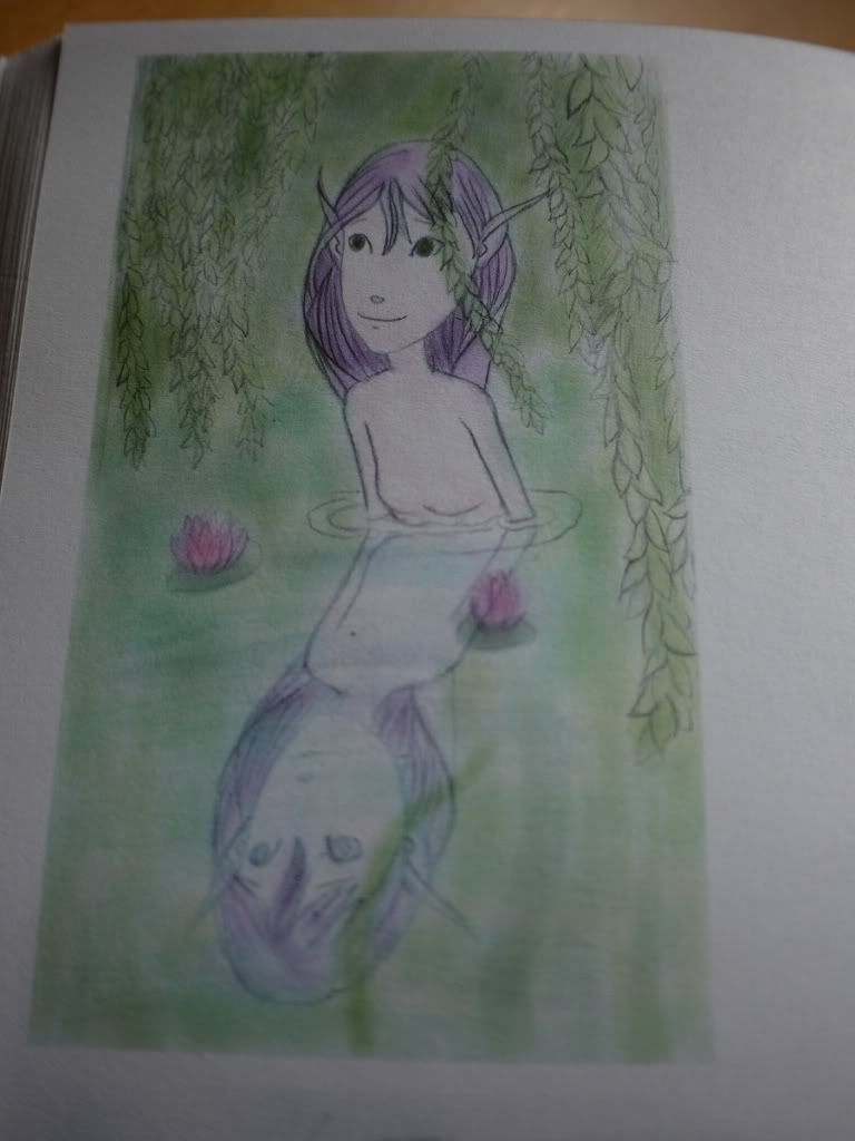
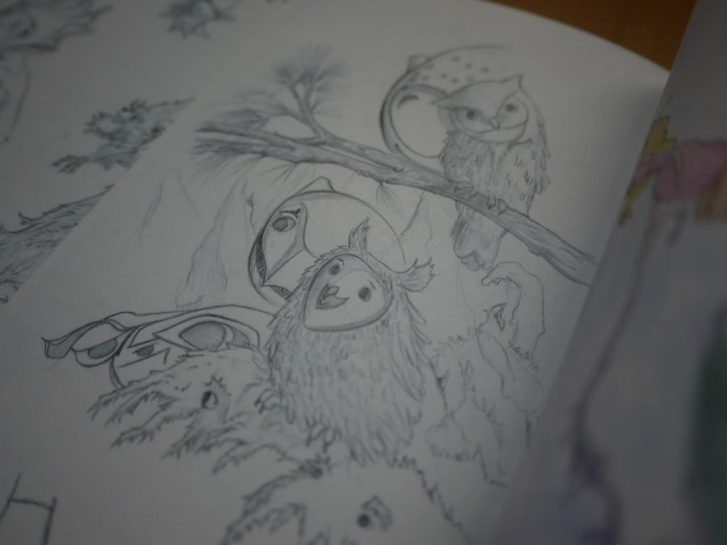
| One of my faves! I love the shading..something more gloomy (just the way I like it hahaha) |
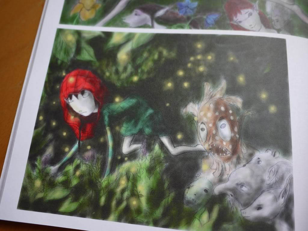 |
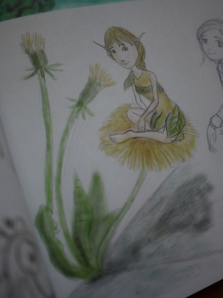
| Again, the green is just beautiful here. The red is what really pops, but I just can't take my eyes off the green and the little flecks of yellow/gold ;) |
And that's really all I have for this book. I did take more pictures than I ended up including in this post, but I limited myself to just the few that really put out what I wanted to get across to you. I think I've mentioned a long time ago that I studied world religion and Greek mythology throughout university and absolutely loved it. Going through this book gave me that same feeling. It's as if I was learning the traditions of fairies, if that makes any sense (not sure if traditions is the right word for it, but you get the point I hope?).
Aside from the art being very beautiful, I do have some small things I wanted to point out regarding the book. Even though the text was very helpful in appreciating the art, it was a bit overwhelming at times. There were some pages with large amounts of text which was a lot to digest. It would be nice if some art pieces were placed between them to break up the reading a bit, especially that full page of pure text. It really helps to let the little blurbs you read sink in by checking out a simple fairy sketch or something before going on to reading more. Another small (and sort of unnecessary) thing I would have done was use a more cursive type font. I think it would really match the lovely art work!
Overall, I had a very enjoyable weekend of reading. I'm someone who likes to read and having lots of little interesting stories and snippets about fairies to go through while admiring the art was a major plus for me. I highly doubt it'll take any of you two days to go through it though, haha. I just like to read and re-read some text. The colour choices were always beautiful and delicate, which certainly felt very "fairy-like" and almost magical.
If anyone is interested in learning more about Ty Hulse's art or this book, please visit this site for more details.
Hope everyone liked this little review, and enjoy the rest of your Sundays!


0 comments:
Post a Comment
Thanks for reading! Feel free to leave us a comment. Any feedback would be greatly appreciated ♥